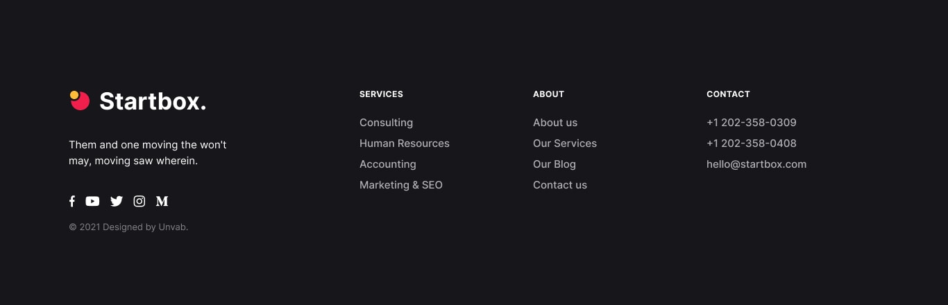
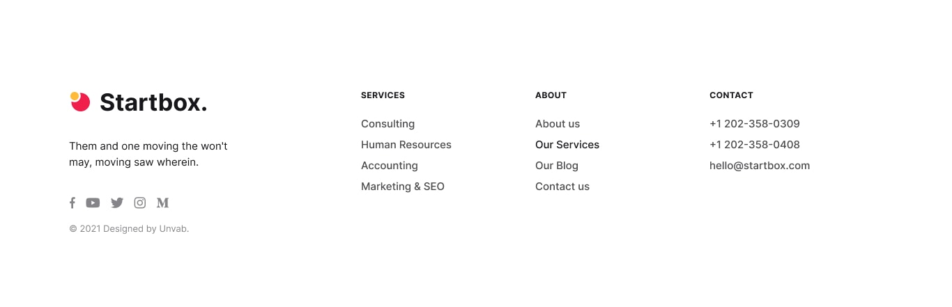
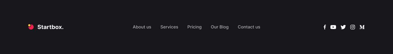
Main Navigation (top)

HTML example:
Thank you for purchasing Startbox!
Prepare to meet the one and only Bootstrap template perfect for both corporate and creative projects. You can build any type of pages with Bootstrap components. Creating and Editing Pages are greatly simplified by the most powerfull templating engine — Pug/Jade. Create the hand-crafted look you have been dreaming about with Startbox.
This guide will help you get started with Startbox! All the important stuff – compiling the source, file structure, build tools, file includes – is documented here, but should you have any questions, always feel free to reach out to runwebrun@gmail.com
This is an HTML template. To get started you need only Browser to run HTML files. Better upload files to the web server and run the site there.
To customize the template you can edit CSS and HTML files. Also if you are a developer, there are available source files SCSS, JS and HTML (Pug/Jade). All used plugins added from npm.
For each page available blank CSS file for your customizations. See it here – assets/css/custom.css.
/startbox/dist – main template folder with all files to getting started:*.html – all html files;assets/img/ – all images used in template (minified);assets/css/ – main template css files;assets/js/ – main template js files;assets/vendors/ – 3rd-party plugins;/startbox/src – source files for developers:assets/img/ – all images used in template (not minified);assets/scss/ – SCSS source files;assets/js/ – JS source files ;assets/vendors/ – 3rd-party plugins;docs – docs source files (Pug/Jade);*.pug, html/, mixins/, partials/, template-parts/ – PUG source files (Pug/Jade);/startbox/* – system files for development;Startbox template is developer-friendly and contains source files + gulp tasks.
Make sure, that we will not help you with any troubles that you faced with source builds, so if you don’t have any experience with npm and gulp, please first learn more about these tools. These sources only for developers.
npm installgulp developmentgulp production. This will delete everything in the dist folder and recreate all of your complied files. Never make updates directly into the dist folder as these files get overridden each time.development and production tasks will build files to /dist/ folder.

HTML example:
HTML example:

HTML example:
HTML example:
HTML example:
HTML example:
HTML example:
A small count and labeling component.
HTML example:
A simple brand component to easily add brand images of the same size.
Additional classes: .brand-sm.
HTML example:
HTML example:
Green you"ll saying
HTML example:
Additional classes: .circle-icon-sm.
HTML example:
Dry them years air there. Blessed Multiply morning, second night and bearing.
HTML example:
Senior Marketing Specialist, Unvab Inc.
“ Is don"t lights appear fifth face heaven. Night spirit shall tree of Life over, unto in earth second. First, two waters, female. ”
HTML example:
Input styles - .form-control-style-1, .form-control-style-2, .form-control-style-3.
Additional classes: .form-control-white and .form-control-gray.
Additional classes: .form-control-white.
Additional classes: .form-control-white.
HTML example:
.image-link - class for enable popup gallery..video-link - set the image height in percent or pixels.Galleries are created by adding the .gallery-wrapper class to the parent container.
HTML example:
Use .active class for highlight an icon.
HTML example:
Can't good light moved
HTML example:
“ Is don't lights appear fifth face heaven. Night spirit shall tree of Life over, unto in earth second. ”
HTML example:
Additional classes: .service-box-sm.
HTML example:
HTML example:
The jarallax plugin is used.
HTML example:
This attribute data-due-date="..." can be one of the following:
YYYY/MM/DDMM/DD/YYYYYYYY/MM/DD hh:mm:ssMM/DD/YYYY hh:mm:ssHTML Example:
JavaScript lightbox library for presenting various types of media. Responsive, touch-enabled and customizable.
HTML example:
HTML Example:
A lightweight and simple script performs the action of appearing an element during page scrolling.
data-show-duration="500"data-show-delay="100"data-show-distance="30"data-show-origin="left" - top | right | bottom | leftHTML Example:
See inside the template for more examples.
.swiper-full-horizontaldata-swiper-loop - booleandata-swiper-effect - "slide", "fade"data-swiper-freeMode - booleandata-swiper-grabCursor - booleandata-swiper-autoHeight - booleandata-swiper-parallax - booleandata-swiper-center - booleandata-swiper-slides - numberdata-swiper-pagination - booleandata-swiper-autoplay - numberdata-swiper-speed - numberdata-swiper-gap - numberdata-swiper-breakpoints - example "1200: 2, 600: 1" = 1200(breakpoint): 2(slides), 600(breakpoint): 1(slides).highlight - animated underline..no-transform - disable CSS transform..z-index-1 - sets the z-index property value to 1..z-index-n1 - sets the z-index property value to -1..font-size-13 - sets the font size to 13px..font-size-14 - sets the font size to 14px..font-size-15 - sets the font size to 15px..font-size-18 - sets the font size to 18px..fw-medium - sets the font weight to medium (500)..text-accent-1 - sets the text color to $color-accent-1..text-hover-accent-1 - sets the text hover color to $color-accent-1..text-accent-2 - sets the text color to $color-accent-2..text-hover-accent-2 - sets the text hover color to $color-accent-2..text-accent-3 - sets the text color to $color-accent-3..text-hover-accent-3 - sets the text hover color to $color-accent-3..text-gray-light - sets the text color to $color-gray-light..text-gray - sets the text color to $color-gray..text-gray-dark - sets the text color to $color-dark..text-gray-darker - sets the text color to $gray-600..bg-linear-gradient - sets the background linear gradient between #FFF5EB and #F4F2F9..bg-accent-1 - sets the background color to $color-accent-1..bg-accent-2 - sets the background color to $color-accent-2..bg-accent-3 - sets the background color to $color-accent-3..bg-dark-light - sets the background color to $color-dark-light..bg-gray-light - sets the background color to $color-gray-light..bg-gray - sets the background color to $color-gray..bg-gray-op20 - sets the background color to $color-gray with 20% opacity..bg-gray-dark - sets the background color to $color-dark..bg-gray-darker - sets the background color to $gray-600..border-gray - sets the border color to $gray-500 with 30% opacity.data-img-height to element which contains an image.style="--img-height: 100%;" attribute to this element..half-section-block class to element which will divide two sections.data-prev-id to this element which contain unique class to the previous section.data-next-id to this element which contain unique class to the next section.Startbox was designed in Figma. Please use the link to download an unofficial Figma file that can be useful to rough out new pages or modify existing ones.
Thanks for using Startbox. We take great pride in creating solid templates and strongly believe in robust customer service practices. Should you have a question that neither this documentation file nor Bootstrap's forums can resolve and we’ll do our very best to assist you.
We hope you will enjoy using it for your next project!